What is the forecast dashboard?
Following login, users arrive at the Forecast Dashboard.
Users can navigate to other areas of the Datarithm system via the tabs located across the top of every page:
✓ The Balance tab will bring users to the Balance Dashboard and the various balancing tasks
✓ The Cycle Count tab provides access to the Cycle Count Wizard
✓ The Reports tab reveals various system reports
✓ The Settings tab provides users with the ability to change various system settings.
✓ The Help tab provides users with direct access to Support Center and User Manuals.
Note that users have access to various portions of the application depending upon the type of user account that is used. For example, a Company Level user will have access to the Settings tab, but not the Cycle Count tab, while a Pharmacy Level user will have access to the various Balancing task menu items and the Cycle Count tab, but will not have access to the Settings tab.
Like the tabs, the green taskbar is also displayed on every page in the system, unless it is minimized via the X in the top right of the bar. The taskbar provides direct access to tasks to be accomplished based on the user’s account type.
US-based users will also notice a blue banner displayed at the top of the page, which provides direct access to PharmSaver’s inventory offerings, including deeply discounted short-date buying
opportunities.
See complete details regarding PharmSaver later in this manual.
The Forecast Dashboard displays an array of Key Performance Indicators ("KPI's") for a more holistic view of the state of your inventory and the changes that have occurred to your inventory over time.
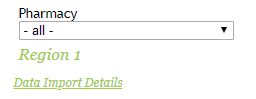
If your company has multiple stores you can select the Region and Pharmacy to view the Forecast
Dashboard for each pharmacy location:
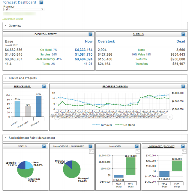
The Datarithm Effect tile illustrates how the customer’s inventory has changed since starting with
Datarithm. “Base” reflects the customer’s inventory profile from when the customer first onboarded with Datarithm. “Now” reflects the customer’s current inventory profile. For chains (multiple locations) where Datarithm "start" dates were staggered over time, the displayed "Base" date will reflect the starting date for the first location.
The Surplus tile provides several valuable metrics related to the customer’s overall Surplus inventory (on hand amounts that are above and beyond what is expected based upon replenishment points and perpetual inventory best practices) as well as the subset of surplus inventory that is considered either “Overstock” (i.e. items that are in surplus but not “Dead”) or “Dead” (items with 4 or more months of no usage). Click on the tile headers (Surplus, Overstock, or Dead) to navigate to the Surplus Inventory Report filtered on that respective surplus type.
The Managed vs. Unmanaged tile illustrates the portions of the customer’s inventory for which
replenishment points are managed (replenishment point updates are enabled and Do Not Manage on individual items is false) and unmanaged (replenishment point updates are disabled or Do Not Manage on individual items is true). The user can flip from a chart view to a text view by clicking the “T” icon.
The Managed tile displays a chart illustrating the number of items that Datarithm would like to increase or decrease replenishment points as well as the corresponding aggregate dollar impact for those items that Datarithm has been permitted to manage (Do Not Manage is false, i.e. Datarithm is not "blocked"). Click on either bar chart to navigate to the respective detail report (increases or decreases) for a list of the individual inventory items. The user can flip from a chart view to a text view by clicking the “T” icon.
Unmanaged (Blocked) displays the number of items that Datarithm would like to increase or decrease replenishment points as well as the corresponding aggregate dollar impact for those items that Datarithm is not permitted to manage (Do Not manage is true, i.e. Datarithm is "blocked"). Click on the chart to navigate to the Do Not Manage Report for details. The user can flip from a chart view to a text view by clicking the “T” icon.
The Service Level tile shows three important service levels. The "Current" Service Level is based upon all replenishment points that currently reside in the pharmacy management system (PMS). The“Unmanaged” service level shows the service level for items that are not being managed by Datarithm, while the “Managed” service level shows the same metric for items that are being managed by Datarithm. Click on the chart to navigate to the Service Level Slider where replenishment point increases and corresponding service levels are managed.
Status shows a profile of the customer’s inventory when segmented into Recurring, Sporadic, and New categories. This is important because Datarithm treats (i.e. forecasts replenishment points, makes balancing recommendations, etc.) each category differently. Click on a slice of the pie chart to view inventory items for that category.
Progress Overview illustrates how On Hand ($) and Inventory Turnover have changed since the customer onboarded with Datarithm. Click on the chart to navigate to the corresponding Progress Report.
The Data Import Details link, located at the top left of the screen under the Forecast Dashboard page title, provides Datarithm users with audit information related to the delivery of data by the Pharmacy Management System (PMS) to Datarithm, the last time Datarithm forecasted your inventory and the last time your PMS retrieved the updates provided by Datarithm:
Clicking on Data Import Details will open a pop-up window displaying the details mentioned above for all pharmacies within your company:
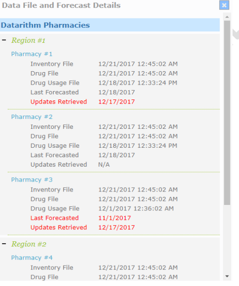
Whenever the Inventory File and/or Drug File for any of your stores under the Data File and Forecast Details are in red it means that these files have not been delivered to Datarithm by the Pharmacy Management System as required. When this happens, a red banner is displayed, informing users that various features within the system have been disabled at the affected location(s) due to potentially inaccurate On Hand data:
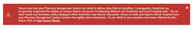
Please note that Datarithm monitors the delivery of data from your PMS. When these delivery failures occur, Datarithm contacts your PMS vendor to prompt them to correct any data interface issues. However, if these errors persist for several days in a row, Datarithm advises customers to contact their PMS vendor directly.
When the Updates Retrieved is displayed in red for any of your stores under the Data File and Forecast Details, it means that your PMS has failed to retrieve Datarithm’s updates and an additional red bar is displayed at the top of the page, which includes a link to the Updates Retrieval Report:
